Neal Grantham
uspops: US Census Bureau population estimates in R
I am sick and tired of data analyses that do not account for population size!
@UpshotNYT Wow, it's almost like states with larger populations give birth to more MacArthur fellows. http://t.co/Se6kvpQhkz
— Neal Grantham 🆖 (@nsgrantham) September 17, 2014
States with larger populations will simply produce a greater number of MacArthur Fellows. A better judge of “Where Creativity Is Born” (whatever that means) would be to find the rate of MacArthur Fellows among each state’s population.
But look, I am sympathetic to the extra work this requires. Now you must track down a dataset on state populations, which is surprisingly hard to find in a convenient form (I’ve tried!).
Introducing uspops, an R package that contains two datasets provided by the US Census Bureau:
us_pops: For each year from 1900 to 2018, the estimated population of the United States on July 1st. Two exceptions are 1970 and 1980 where the estimates are made for April 1st.state_pops: For each year from 1900 to 2018, the estimated population of all 50 states (Alaska and Hawaii since 1950), District of Columbia, and Puerto Rico (since 2010) on July 1st. Two exceptions are 1970 and 1980 where the estimates are made for April 1st.
Read more at github.com/nsgrantham/uspops.
Let’s see what state populations look like over time.
library(tidyverse)
library(gghighlight)
library(ggdark)
library(uspops)

high_pop_states <- state_pops %>%
  filter(year == 2018) %>%
  arrange(desc(pop)) %>%
  slice(1:10) %>%
  pull(state)

label_params <- list(
  family = "Fira Sans Condensed Light",
  fill = "grey10",
  direction = "y",
  hjust = -2,
  size = 4,
  segment.size = 0.3
)

ggplot(state_pops, aes(year, pop, color = state)) +
  geom_line(size = 0.5) +
  gghighlight(
    state %in% high_pop_states,
    use_group_by = FALSE,
    label_key = state,
    label_params = label_params
  ) +
  geom_vline(xintercept = 2018, size = 0.3) +
  scale_y_continuous(
    breaks = 1e6 * seq(0, 40, by = 5),
    labels = c("0", paste0(seq(5, 40, by = 5), "M"))
  )  +
  scale_x_continuous(
    breaks = c(seq(1900, 2010, by = 10), 2018),
    labels = c("1900", paste0("'", seq(10, 90, by = 10)), "2000", "'10", "'18"),
    limits = c(1900, 2035)
  ) +
  labs(
    title = "California is the most populous state at nearly 40 million people in 2018",
    subtitle = "This is more than double the population of New York, which California overtook in 1963",
    y = "Population estimate",
    x = NULL,
    caption = "Source: US Census Bureau | Graphic: @nsgrantham"
  ) +
  dark_theme_minimal(
    base_family = "Fira Sans Condensed Light",
    base_size = 14
  ) +
  theme(
    panel.grid.major = element_line(size = 0.5, color = "grey20"),
    panel.grid.minor = element_blank(),
    plot.title = element_text(family = "Fira Sans Condensed", face = "bold"),
    plot.background = element_rect(fill = "grey10", color = "grey10"),
    plot.margin = unit(c(1, 1, 1, 1), "lines")
  )
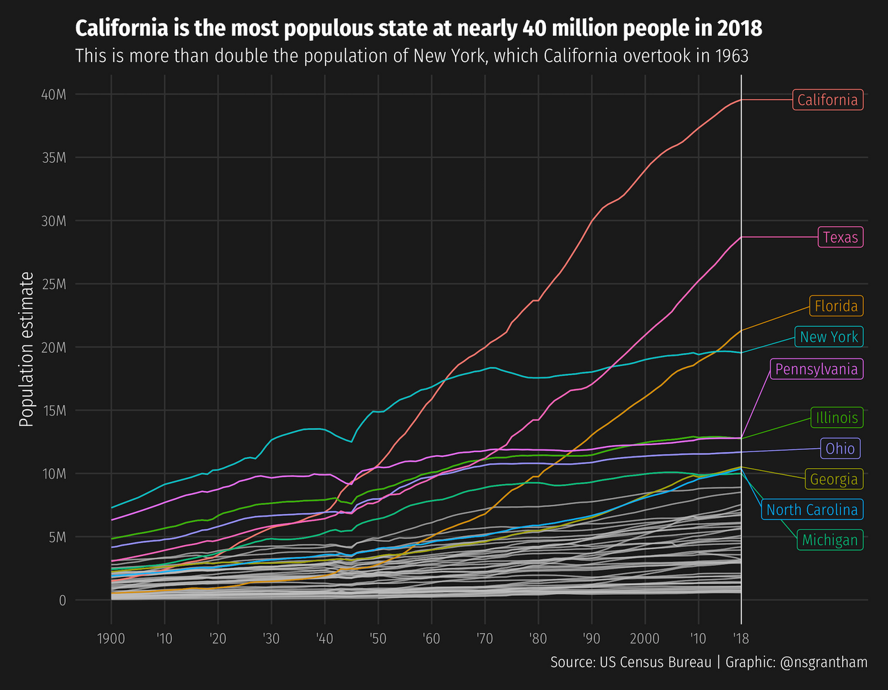
I am not motivated to recreate the Upshot’s visualization with MacArthur Fellows relative to state populations. Judging by this state population plot, however, it appears New York will surely remain on top of, um, birthing creativity, and California will not hold on to 2nd place.