Neal Grantham
Reorder legend to match order of plot elements in ggplot2
ggplot() often orders items in the legend alphabetically when we would prefer that it order them to match the order of elements in the plot.
For example, in a line chart made with geom_line(), the highest line should match the first item in the legend, the next highest line the second item, and so forth.
We show how to achieve this with a well-placed fct_reorder2().
Problem
To demonstrate, let’s use data on crop yields in the United States since 1961.1 Call this dataframe usa_crop_yields.
library(tidyverse)  # 1.3.0

usa_crop_yields <- read_csv("https://raw.githubusercontent.com/rfordatascience/tidytuesday/master/data/2020/2020-09-01/key_crop_yields.csv") %>%
  rename_with(~ gsub(" \\(tonnes per hectare\\)", "", .)) %>%
  pivot_longer(Wheat:Bananas, names_to = "crop", values_to = "yield") %>%
  rename_with(tolower) %>%
  filter(entity == "United States", !is.na(yield)) %>%
  select(year, crop, yield)

usa_crop_yields
## # A tibble: 522 x 3
##     year crop     yield
##    <dbl> <chr>    <dbl>
##  1  1961 Wheat     1.61
##  2  1961 Rice      3.82
##  3  1961 Maize     3.92
##  4  1961 Soybeans  1.69
##  5  1961 Potatoes 22.2
##  6  1961 Beans     1.54
##  7  1961 Peas      1.19
##  8  1961 Barley    1.65
##  9  1961 Bananas  10.5
## 10  1962 Wheat     1.68
## # … with 512 more rows
Take usa_crop_yields and make a plot with ggplot(). Map year to x, yield to y, and crop to color. Apply the line geometry with geom_line(), and hide labels associated with x, y, and color to save on space.
usa_crop_yields %>%
  ggplot(aes(year, yield, color = crop)) +
  geom_line() +
  labs(x = NULL, y = NULL, color = NULL)
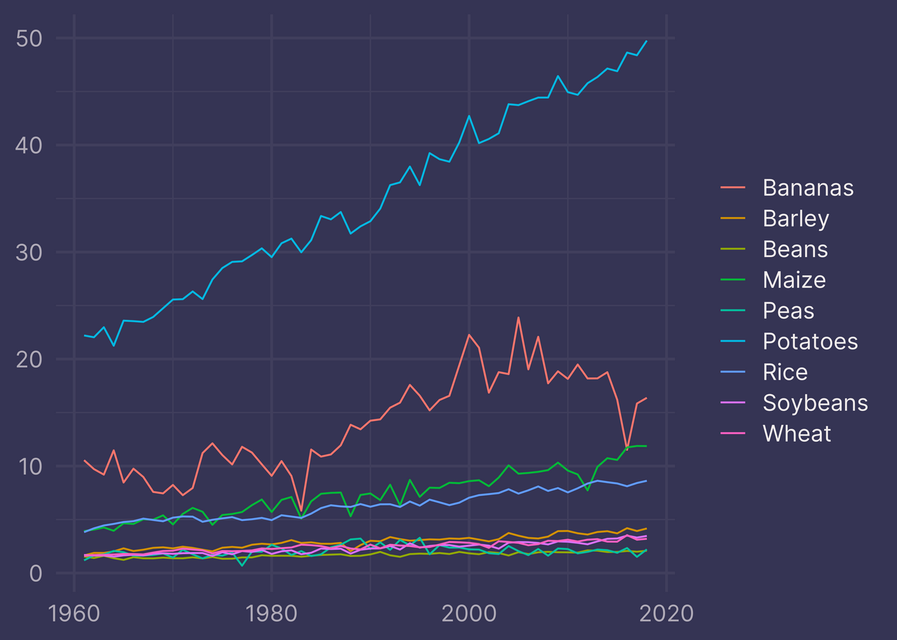
Not bad, but it suffers from an unnecessary cognitive hurdle — the legend order does not match the order of elements in the plot.
The highest blue line is… Potatoes (or is it Peas?), the red line is Bananas, the green line is… Maize?
While the plot is factually correct, it does not communicate the information as effectively as it could.
Solution
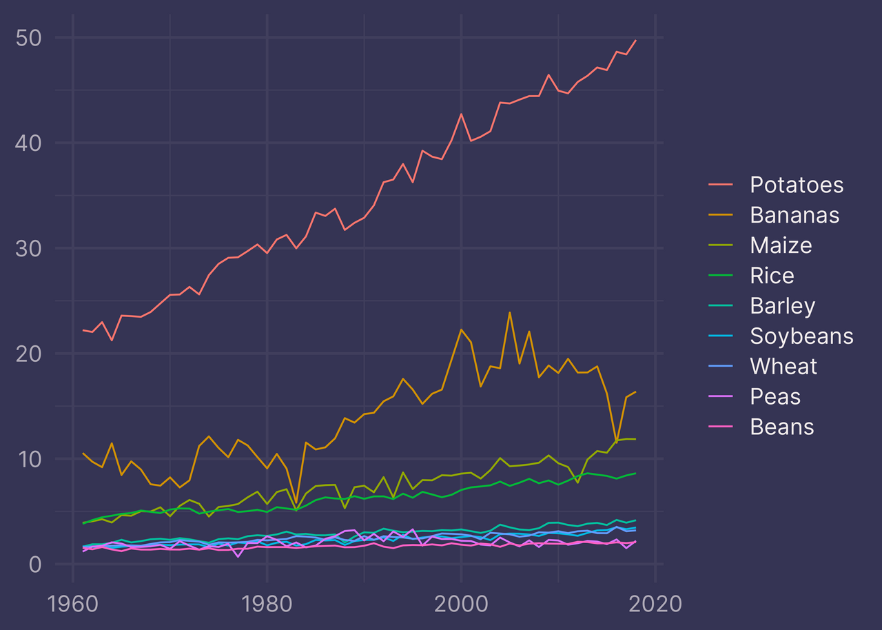
Reorder the legend to match the order of plot elements by mutating the crop variable in usa_crop_yields with fct_reorder2().
usa_crop_yields %>%
  mutate(crop = fct_reorder2(crop, year, yield)) %>%
  ggplot(aes(year, yield, color = crop)) +
  geom_line() +
  labs(x = NULL, y = NULL, color = NULL)

Potatoes on top, followed by Bananas, Maize, and so on.
That’s more like it!
How does this work?
Take a closer look at the structure of crop in usa_crop_yields with str().
crop <- usa_crop_yields %>% pull(crop)

str(crop)
## chr [1:522] "Wheat" "Rice" "Maize" "Soybeans" "Potatoes" "Beans" "Peas" ...
crop is a character vector.
When R sorts the values of a character vector, it always does so alphabetically.
crop %>%
  unique() %>%
  sort()
## [1] "Bananas"  "Barley"   "Beans"    "Maize"    "Peas"     "Potatoes" "Rice"
## [8] "Soybeans" "Wheat"
To display a character vector in non-alphabetical order we must encode it as a factor.
We can create a factor with factor() and provide it a character vector of valid levels.
# random order, strictly for the sake of demonstration
crop_levels <- c("Peas", "Maize", "Soybeans", "Rice", "Bananas", "Wheat", "Barley", "Beans", "Potatoes")

crop_fct <- factor(crop, crop_levels)
crop_fct %>%
  unique() %>%
  sort()
## [1] Peas     Maize    Soybeans Rice     Bananas  Wheat    Barley   Beans
## [9] Potatoes
## Levels: Peas Maize Soybeans Rice Bananas Wheat Barley Beans Potatoes
In most cases we don’t need to provide the levels directly. The forcats package provides functions to take care of this for us in a variety of different ways.2
See forcats.tidyverse.org/reference for a list of available functions in forcats.
Among the listed functions is fct_reorder2(). Take a look at its documentation to get a feel for how it works.
fct_reorder2()[is useful] for 2d displays where the factor is mapped to a non-position aesthetic.
Hmm, okay. Not helpful.
Instead, focus on its usage.
fct_reorder2(.f, .x, .y, .fun = last2, ..., .desc = TRUE)
So that means fct_reorder2(crop, year, yield) is equivalent to fct_reorder2(.f = crop, .x = year, .y = yield, .fun = last2, .desc = TRUE).
To demonstrate how this function call behaves, we can recreate our solution using factor() and a character vector of levels instead of using fct_reorder2().
crop_levels <- usa_crop_yields %>%
  group_by(crop) %>%  # since .f = crop
  summarize(
    yield = last(yield, order_by = year),  # since .x = year, .y = yield, .fun = last2
    .groups = "drop"
  ) %>%
  arrange(desc(yield)) %>%  # since .desc = TRUE
  pull(crop)

crop_levels
## [1] "Potatoes" "Bananas"  "Maize"    "Rice"     "Barley"   "Soybeans" "Wheat"
## [8] "Peas"     "Beans"
usa_crop_yields %>%
  mutate(crop = factor(crop, crop_levels)) %>%
  ggplot(aes(year, yield, color = crop)) +
  geom_line() +
  labs(x = NULL, y = NULL, color = NULL)
We get the same result. Great!
Don’t use this latter code as an alternative to our solution, however. It’s verbose and inefficient.
When you need to reorder your legend to match the order of plot elements, use fct_reorder2().
1. The crop yield data comes from Our World in Data. In this post we use a subset of the data called key_crop_yields.csv available from Tidy Tuesday. ↩
2. What’s with the funny name? It’s a package for categorical variables, hence forcats. It’s also an anagram of “factors”. And, hey, what’s not to like about another cat-themed package name like purrr? ↩