Neal Grantham
3 alternatives to a discrete color scale legend in ggplot2
ggplot() includes a color scale legend when you map a variable to the color aesthetic.
If the variable is a character or factor type, then the color scale takes a finite set of values. We call this a discrete color scale.
When the number of values in the discrete color scale is relatively small — about 5 or fewer — you may consider removing the legend entirely and encoding the scale directly in the plot.
In this post I walk through three different ways to do this.
Problem
Load the penguins dataset from the palmerpenguins package.
library(tidyverse)       # 1.3.0
library(palmerpenguins)  # 0.1.0

penguins
## # A tibble: 344 x 8
##    species island bill_length_mm bill_depth_mm flipper_length_… body_mass_g
##    <fct>   <fct>           <dbl>         <dbl>            <int>       <int>
##  1 Adelie  Torge…           39.1          18.7              181        3750
##  2 Adelie  Torge…           39.5          17.4              186        3800
##  3 Adelie  Torge…           40.3          18                195        3250
##  4 Adelie  Torge…           NA            NA                 NA          NA
##  5 Adelie  Torge…           36.7          19.3              193        3450
##  6 Adelie  Torge…           39.3          20.6              190        3650
##  7 Adelie  Torge…           38.9          17.8              181        3625
##  8 Adelie  Torge…           39.2          19.6              195        4675
##  9 Adelie  Torge…           34.1          18.1              193        3475
## 10 Adelie  Torge…           42            20.2              190        4250
## # … with 334 more rows, and 2 more variables: sex <fct>, year <int>
Check out the palmerpenguins package documentation for an overview of the dataset, some example visualizations, and fantastic penguin artwork by Allison Horst.
I particularly like the colors they use for each penguin species. Let’s use the same ones.1
# species colors from allisonhorst.github.io/palmerpenguins
colors_frame <- tribble(
  ~species, ~color,
  "Chinstrap", "#BB63C4",
  "Gentoo",  "#468088",
  "Adelie", "#EF8232"
)

colors_frame
## # A tibble: 3 x 2
##   species   color
##   <chr>     <chr>
## 1 Chinstrap #BB63C4
## 2 Gentoo    #468088
## 3 Adelie    #EF8232
Now, create a scatter plot that we will modify throughout this post.
Begin with penguins, select species, flipper_length_mm, and bill_length_mm, drop rows with NA, join with colors_frame on species, and encode species and color as factors with their levels as ordered in colors_frame.
penguins_with_colors <- penguins %>%
  select(species, flipper_length_mm, bill_length_mm) %>%
  drop_na() %>%
  left_join(colors_frame, by = "species") %>%
  mutate(
    species = fct_relevel(species, colors_frame$species),
    color = fct_relevel(color, colors_frame$color)
  )

penguins_with_colors
## # A tibble: 342 x 4
##    species flipper_length_mm bill_length_mm color
##    <fct>               <int>          <dbl> <fct>
##  1 Adelie                181           39.1 #EF8232
##  2 Adelie                186           39.5 #EF8232
##  3 Adelie                195           40.3 #EF8232
##  4 Adelie                193           36.7 #EF8232
##  5 Adelie                190           39.3 #EF8232
##  6 Adelie                181           38.9 #EF8232
##  7 Adelie                195           39.2 #EF8232
##  8 Adelie                193           34.1 #EF8232
##  9 Adelie                190           42   #EF8232
## 10 Adelie                186           37.8 #EF8232
## # … with 332 more rows
Next, use ggplot() on penguins_with_colors and map flipper_length_mm to x, bill_length_mm to y, and color to color. Apply the point geometry with geom_point() to produce a scatter plot.
Because the color variable identifies the exact hex color codes to use for each species, we apply the identity scale to it with scale_color_identity(). Within this function, guides = "legend" includes the legend and labels = colors_frame$species replaces the hex color codes with species names.
Finally, modify the labels for title, subtitle, x, y, and color.
p <- ggplot(
  penguins_with_colors,
  aes(flipper_length_mm, bill_length_mm, color = color)
) +
  geom_point() +
  scale_color_identity(guide = "legend", labels = colors_frame$species) +
  labs(
    title = "Antarctic penguins come in all shapes and sizes",
    subtitle = "And three different species, too.",
    x = "Flipper Length (mm)",
    y = "Bill Length (mm)",
    color = "Species"
  )

p
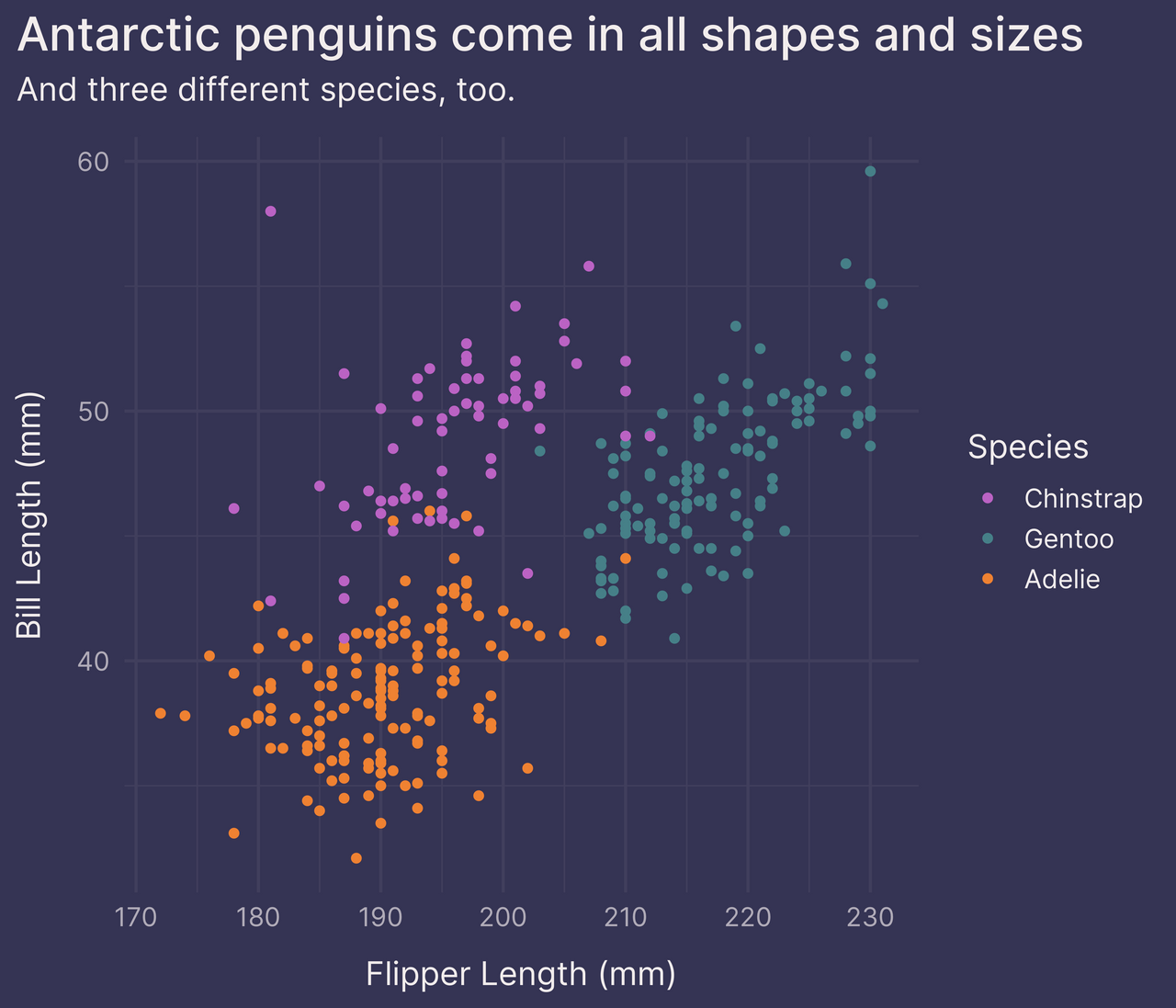
Alright. Not shabby.
But the legend takes up a lot of space. It makes the plot feel cramped.
To save on space, we can move the legend inside the plot panel with legend.position in theme().
p +
  theme(legend.position = c(0.83, 0.16))  # position 83% right, 16% up
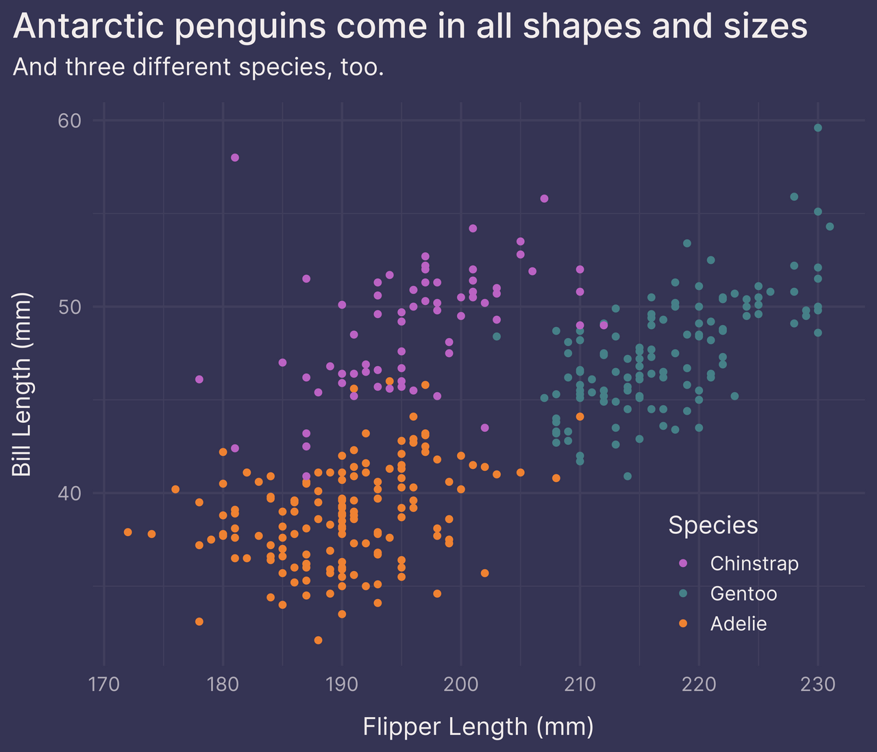
That’s a little better.
What other options do we have?
The following are three alternatives to including the discrete color scale legend.
Option 1: facet_wrap()
One option is to facet on species with facet_wrap().
This transforms the original plot into three smaller plots, one for each species.
p +
  guides(color = FALSE) +  # remove the legend
  facet_wrap(~ species, ncol = 1)
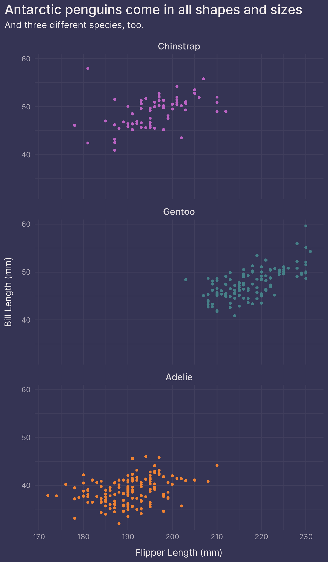
In doing so, we no longer require the color aesthetic to differentiate between species. We could remove color altogether if we wanted.
If we’d rather not break up the original plot into smaller plots, however, we can try one of the following two options.
Option 2: geom_text()
Another option is to place labels on the plot with geom_text().
This takes patience. You have to eyeball the original plot and manually choose the coordinates for each label.
species_labels <- tribble(
  ~species, ~flipper_length_mm, ~bill_length_mm,
  "Chinstrap", 190, 55,
  "Gentoo",    225, 43,
  "Adelie",    200, 33
) %>%
  left_join(colors_frame, by = "species")

p +
  guides(color = FALSE) +  # remove the legend
  geom_text(data = species_labels, aes(label = species), size = 5)
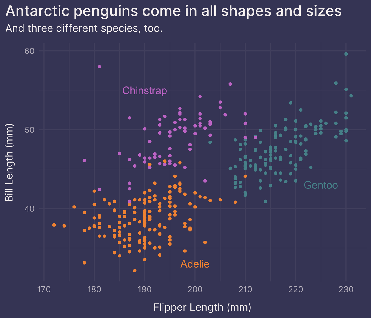
Not bad!
This looks pretty good, but it can take considerable trial and error until we find the best position for each label. And it’s not a robust solution — if the data changes (e.g., we add new observations, we find an error and have to delete some observations from the dataset, etc.) then the labels may have to be moved.
For these reasons I tend to prefer the last option.
Option 3: ggtext::element_markdown()
My favorite option is to color text in the subtitle with the ggtext package.
This works in two stages.
First, write the subtitle text as an HTML string. Wrap each species name in a span tag and include a style argument with CSS like 'color:#000000' (where we replace #000000 with any hex color code we’d like).
Rather than hardcode the hex color codes, use glue() from the glue package to fill the subtitle text string with values from colors_list, derived below from colors_frame.
library(glue)  # 1.4.2

colors_list <- colors_frame %>%
  deframe() %>%  # convert data frame to named vector
  as.list()      # convert to list

subtitle_text <- glue(
  "And three different species, too: ",
  "<span style='color:{colors_list$Chinstrap}'>Chinstrap</span>, ",
  "<span style='color:{colors_list$Gentoo}'>Gentoo</span>, and ",
  "<span style='color:{colors_list$Adelie}'>Adelie</span>."
)

subtitle_text
## And three different species, too: <span style='color:#BB63C4'>Chinstrap</span>, <span style='color:#468088'>Gentoo</span>, and <span style='color:#EF8232'>Adelie</span>.
Second, load the ggtext package and use its element_markdown() function within theme() to parse the HTML/CSS text appropriately.
library(ggtext)  # 0.1.1

p +
  guides(color = FALSE) +  # remove the legend
  labs(subtitle = subtitle_text) +
  theme(plot.subtitle = element_markdown())
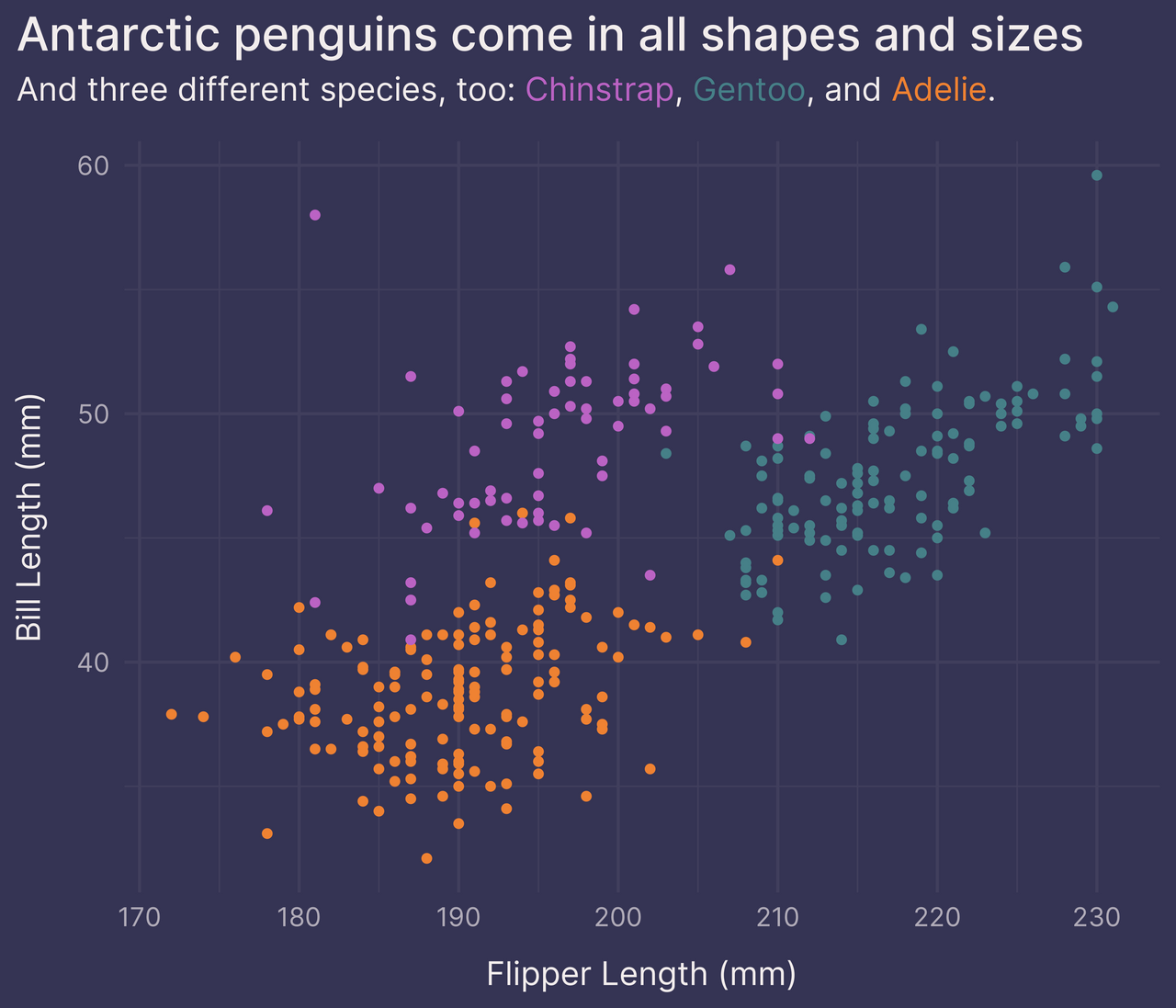
There we go!
Now, this option is more complex than the previous two options, requiring some basic knowledge of HTML/CSS syntax and a dependency on the ggtext package.2
But in my opinion it’s worth the effort.
1. To get the hex color codes for each penguin species, I used the Digital Color Meter application that comes installed on macOS. Open the application and in the menu bar choose View > Display Values > as Hexidecimal. Then, while the application is active, hover your mouse over the color you want and use Cmd+Shift+C to copy the hex color code to your clipboard.
2. Isn’t the glue package another dependency? Not necessarily. When you run library(tidyverse), the glue package is secretly loaded but not attached. That means you can use glue::glue() without running library(glue). Or, if you’d prefer, you can avoid glue() and use paste() instead.