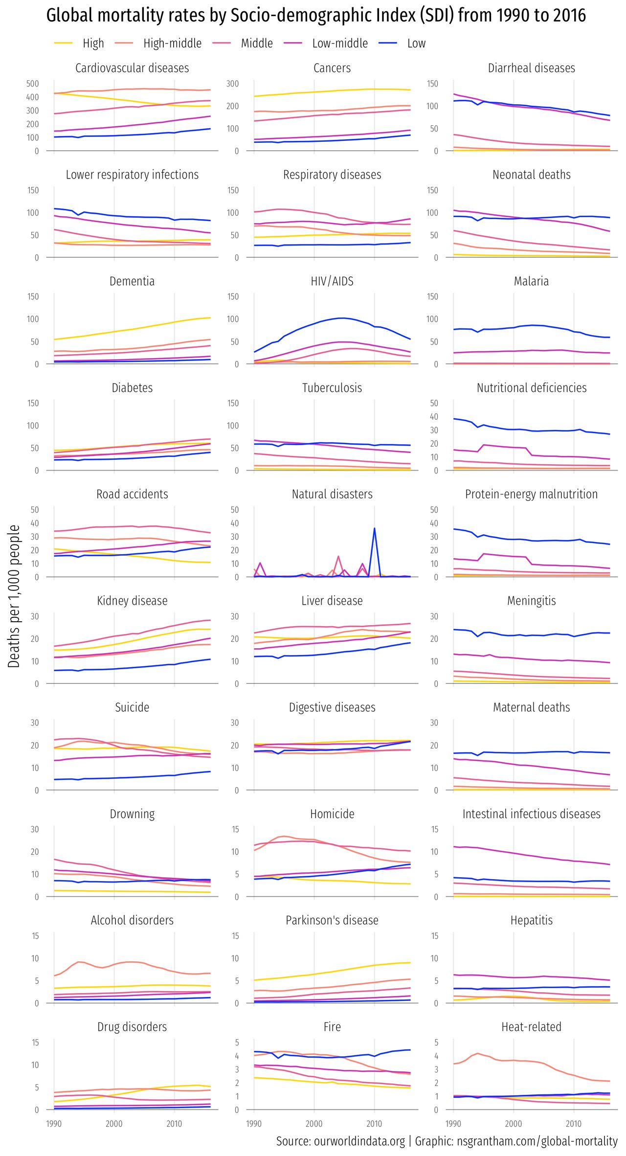
Death comes for us all. And what a splendid variety of forms it can take! Cardiovascular disease, cancer, natural disasters, malaria, infections — the list is almost endless.
This week we’ll look at mortality data collected by the World Health Organization (WHO) to see how cause of death varies by the socio-demographic index of the country in which you live.
library(tidyverse)
library(readxl)

download.file("https://github.com/rfordatascience/tidytuesday/blob/master/data/2018/2018-04-16/global_mortality.xlsx?raw=true", "global_mortality.xlsx")

mortality <- read_xlsx("global_mortality.xlsx") %>%
  filter(str_detect(country, "SDI")) %>%
  rename(sociodemographic_index = country) %>%
  mutate(sociodemographic_index = sub(" SDI", "", sociodemographic_index)) %>%
  mutate(sociodemographic_index = fct_relevel(sociodemographic_index, !! c("High", "High-middle", "Middle", "Low-middle", "Low")))

mortality
# A tibble: 135 x 35
   sociodemographi… country_code  year `Cardiovascular… `Cancers (%)` `Respiratory di…
   <chr>            <chr>        <dbl>            <dbl>         <dbl>            <dbl>
 1 High             NA            1990             42.7          24.2             4.45
 2 High             NA            1991             42.3          24.4             4.47
 3 High             NA            1992             41.8          24.6             4.50
 4 High             NA            1993             41.4          24.8             4.56
 5 High             NA            1994             40.9          25.0             4.59
 6 High             NA            1995             40.5          25.1             4.65
 7 High             NA            1996             40.1          25.4             4.70
 8 High             NA            1997             39.7          25.6             4.76
 9 High             NA            1998             39.2          25.8             4.81
10 High             NA            1999             38.8          25.9             4.89
# … with 125 more rows, and 29 more variables: `Diabetes (%)` <dbl>, `Dementia (%)` <dbl>,
#   `Lower respiratory infections (%)` <dbl>, `Neonatal deaths (%)` <dbl>, `Diarrheal diseases
#   (%)` <dbl>, `Road accidents (%)` <dbl>, `Liver disease (%)` <dbl>, `Tuberculosis
#   (%)` <dbl>, `Kidney disease (%)` <dbl>, `Digestive diseases (%)` <dbl>, `HIV/AIDS
#   (%)` <dbl>, `Suicide (%)` <dbl>, `Malaria (%)` <dbl>, `Homicide (%)` <dbl>, `Nutritional
#   deficiencies (%)` <dbl>, `Meningitis (%)` <dbl>, `Protein-energy malnutrition (%)` <dbl>,
#   `Drowning (%)` <dbl>, `Maternal deaths (%)` <dbl>, `Parkinson disease (%)` <dbl>, `Alcohol
#   disorders (%)` <dbl>, `Intestinal infectious diseases (%)` <dbl>, `Drug disorders
#   (%)` <dbl>, `Hepatitis (%)` <dbl>, `Fire (%)` <dbl>, `Heat-related (hot and cold exposure)
#   (%)` <dbl>, `Natural disasters (%)` <dbl>, `Conflict (%)` <dbl>, `Terrorism (%)` <dbl>
The dataset is in a wide format, so we’ll need to pivot into a longer, tidy format.
mortality <- mortality %>%
  select_if(~ all(!is.na(.))) %>%
  rename_all(~ sub(" [(]%[)]", "", .)) %>%
  gather(cause_of_death, deaths_per_1k, -sociodemographic_index, -year) %>%
  mutate(deaths_per_1k = 10 * deaths_per_1k,
         cause_of_death = replace(cause_of_death, cause_of_death == "Parkinson disease", "Parkinson's disease"),
         cause_of_death = replace(cause_of_death, cause_of_death == "Heat-related (hot and cold exposure)", "Heat-related"))

mortality
# A tibble: 4,050 x 4
   sociodemographic_index  year cause_of_death          deaths_per_1k
   <chr>                  <dbl> <chr>                           <dbl>
 1 High                    1990 Cardiovascular diseases          427.
 2 High                    1991 Cardiovascular diseases          423.
 3 High                    1992 Cardiovascular diseases          418.
 4 High                    1993 Cardiovascular diseases          414.
 5 High                    1994 Cardiovascular diseases          409.
 6 High                    1995 Cardiovascular diseases          405.
 7 High                    1996 Cardiovascular diseases          401.
 8 High                    1997 Cardiovascular diseases          397.
 9 High                    1998 Cardiovascular diseases          392.
10 High                    1999 Cardiovascular diseases          388.
# … with 4,040 more rows
This part looks a little esoteric at first, but the point of it is to calculate an invisible upper limit on a series of facetted plots.
parse_factor_to_numeric <- function(x) as.numeric(levels(x))[x]

yvals <- mortality %>%
  group_by(cause_of_death) %>%
  summarize(ymax = max(deaths_per_1k),
            yupper = cut(max(deaths_per_1k), c(0, 5, 15, 30, 50, 150, 300, 500),
                         labels = c(5, 15, 30, 50, 150, 300, 500))) %>%
  mutate(yupper = parse_factor_to_numeric(yupper)) %>%
  arrange(desc(ymax))

mortality <- mortality %>%
  left_join(yvals, by = "cause_of_death") %>%
  mutate(cause_of_death = factor(cause_of_death, levels = yvals$cause_of_death))

mortality
# A tibble: 4,050 x 6
   sociodemographic_index  year cause_of_death          deaths_per_1k  ymax yupper
   <chr>                  <dbl> <fct>                           <dbl> <dbl>  <dbl>
 1 High                    1990 Cardiovascular diseases          427.  459.    500
 2 High                    1991 Cardiovascular diseases          423.  459.    500
 3 High                    1992 Cardiovascular diseases          418.  459.    500
 4 High                    1993 Cardiovascular diseases          414.  459.    500
 5 High                    1994 Cardiovascular diseases          409.  459.    500
 6 High                    1995 Cardiovascular diseases          405.  459.    500
 7 High                    1996 Cardiovascular diseases          401.  459.    500
 8 High                    1997 Cardiovascular diseases          397.  459.    500
 9 High                    1998 Cardiovascular diseases          392.  459.    500
10 High                    1999 Cardiovascular diseases          388.  459.    500
# … with 4,040 more rows
Lookin’ good.
Now we’ll make line graphs with year on the x-axis, deaths per 1,000 people on the y-axis, and lines colored by the socio-demoographic index (SDI) from ‘Low’ to ‘High’.
ggplot(mortality, aes(year, deaths_per_1k, color = sociodemographic_index)) +
  geom_hline(yintercept = 0,  size = 0.3, alpha = 0.5) +
  geom_hline(aes(yintercept = yupper), size = 0.3, alpha = 0) +
  geom_line() +
  facet_wrap(~ cause_of_death, scales = "free_y", ncol = 3) +
  scale_color_manual(values = c("#ffd700", "#fa8775", "#ea5f94", "#cd34b5", "#0000ff")) +
  labs(title = "Global mortality rates by Socio-demographic Index (SDI) from 1990 to 2016",
       subtitle = "",
       caption = "Source: ourworldindata.org | Graphic: nsgrantham.com/global-mortality",
       x = NULL, y = "Deaths per 1,000 people") +
  theme_minimal(base_family = "Fira Sans Extra Condensed Light", base_size = 12) +
  theme(plot.title = element_text(family = "Fira Sans Extra Condensed"),
        legend.position = c(0.33, 1.0358),
        legend.direction = "horizontal",
        legend.title = element_blank(),
        axis.text = element_text(size = 7),
        panel.grid.major.y = element_blank(),
        panel.grid.minor.y = element_blank(),
        panel.grid.major.x = element_line(size = 0.4),
        panel.grid.minor.x = element_blank())

ggsave("global-mortality.png", width = 6.5, height = 12)
Boy, what a heart-warming graphic.